
Versatile Controller
Versatile Controller
Medical Device Interface
Medical Device Interface
A device that enables the use of multiple single-use endoscopes for ERCP procedures, consolidating image capture, processing, and inputs from storage, video, and fluoroscopy behind a single 10" touchscreen.
A device that enables the use of multiple single-use endoscopes for ERCP procedures, consolidating image capture, processing, and inputs from storage, video, and fluoroscopy behind a single 10" touchscreen.
My Role
My Role
Lead UX Researcher & Designer
Lead UX Researcher & Designer

*Brand name is blurred out and certain names are changed for NDA purposes
*Brand name is blurred out and certain names are changed for NDA purposes
*Brand name is blurred out and certain names are changed for NDA purposes
Overview of my Contributions
Overview of my Contributions
I took the project over as UX lead once initial field research was complete, carrying it forward through information architecture, wireframing, user testing and delivery. My first task was translating a dense set of research findings into a structure a physician could navigate mid-procedure, without ever thinking about it. Later in the project I structured and led the usability testing across multiple hospitals in India using eye-tracking heat maps to validate design decisions that couldn't be judged on instinct alone. My wireframe designs from this project are patent pending. The final interface reached a 90% task success rate in testing, on a device where failure isn't a UX metric, it's a patient risk.
I took the project over as UX lead once initial field research was complete, carrying it forward through information architecture, wireframing, user testing and delivery. My first task was translating a dense set of research findings into a structure a physician could navigate mid-procedure, without ever thinking about it. Later in the project I structured and led the usability testing across multiple hospitals in India using eye-tracking heat maps to validate design decisions that couldn't be judged on instinct alone. My wireframe designs from this project are patent pending. The final interface reached a 90% task success rate in testing, on a device where failure isn't a UX metric, it's a patient risk.
Methodology
Methodology
Contextual Enquiry (Hospital Visits) Competitive Teardown
Information Architecture
Low–High Fidelity Wireframing
Moderated Usability Testing
Design System Alignment (Client Guidelines)
Client Delivery and Presentations
Contextual Enquiry (Hospital Visits) Competitive Teardown
Information Architecture
Low–High Fidelity Wireframing
Moderated Usability Testing
Design System Alignment (Client Guidelines)
Client Delivery and Presentations
01 Context
One Controller, Multiple Inputs
One Controller, Multiple Inputs
The Versatile Controller is a device that lets a physician run multiple single-use endoscopes off one system, capturing and processing image feeds from endoscope cameras, plus inputs and outputs from storage devices, video, and fluoroscopy. All of it is meant to be accessed from a single 10" touchscreen built into the device.
The problem was that the screen didn't have a design yet. The hardware existed; the feature set and interface that would sit on top of it didn't. Physicians and technicians are hard-pressed for time, focused entirely on the procedure, they don't want distractions or additional things to do. Their real needs were efficient, error-free completion of the procedure: image capture, recording and documentation, comparing video input, image enhancement, systems integration. The controller had to make all of that possible across multiple connected scopes and devices, without ever becoming one more thing to manage. And this isn't a screen with room for trial and error, it's used mid-procedure, by a physician whose attention belongs to the patient, not the device.
The Versatile Controller is a device that lets a physician run multiple single-use endoscopes off one system, capturing and processing image feeds from endoscope cameras, plus inputs and outputs from storage devices, video, and fluoroscopy. All of it is meant to be accessed from a single 10" touchscreen built into the device.
The problem was that the screen didn't have a design yet. The hardware existed; the feature set and interface that would sit on top of it didn't. Physicians and technicians are hard-pressed for time, focused entirely on the procedure, they don't want distractions or additional things to do. Their real needs were efficient, error-free completion of the procedure: image capture, recording and documentation, comparing video input, image enhancement, systems integration. The controller had to make all of that possible across multiple connected scopes and devices, without ever becoming one more thing to manage. And this isn't a screen with room for trial and error, it's used mid-procedure, by a physician whose attention belongs to the patient, not the device.


My Involvement timeline

Monsoonfish partnered with the client's R&D team to solve this, and I stepped onto the project just as that early groundwork was starting to take shape. It meant inheriting someone else's research and making it mine quickly enough that the timeline never felt the handoff.
Monsoonfish partnered with the client's R&D team to solve this, and I stepped onto the project just as that early groundwork was starting to take shape. It meant inheriting someone else's research and making it mine quickly enough that the timeline never felt the handoff.
Solution and My Brief

Define the design and feature set for a touchscreen interface that supports a physician through an entire ERCP procedure; visible only when needed, and never in the way.
Define the design and feature set for a touchscreen interface that supports a physician through an entire ERCP procedure; visible only when needed, and never in the way.
02 Research & Discovery
Learning the procedure before touching the screen
Learning the procedure before touching the screen
Before any screen took shape, the team needed to understand the procedure itself, not just the device. Research visits spanned hospitals in India, the UK, the US, and Germany, observing physicians and technicians and mapping the entire pre-, during-, and post-procedure flow. In parallel, the team ran a structured teardown of every competing device on the market (Olympus, Fujifilm, Pentax, Ambu) with Olympus's CV X1 1500 as the benchmark to beat.
Before any screen took shape, the team needed to understand the procedure itself, not just the device. Research visits spanned hospitals in India, the UK, the US, and Germany, observing physicians and technicians and mapping the entire pre-, during-, and post-procedure flow. In parallel, the team ran a structured teardown of every competing device on the market (Olympus, Fujifilm, Pentax, Ambu) with Olympus's CV X1 1500 as the benchmark to beat.

By the time I joined, this groundwork was already documented in detail. I worked through the previous team's research (interview transcripts, user personas, and the competitive analysis) building my own fluency in what physicians and technicians needed, and where the product needed to hold its own strategically against Olympus and the rest. Getting up to speed on someone else's fieldwork fast, without losing any of its nuance, became its own kind of skill on this project.
By the time I joined, this groundwork was already documented in detail. I worked through the previous team's research (interview transcripts, user personas, and the competitive analysis) building my own fluency in what physicians and technicians needed, and where the product needed to hold its own strategically against Olympus and the rest. Getting up to speed on someone else's fieldwork fast, without losing any of its nuance, became its own kind of skill on this project.
Every decision on it also had to hold up against three regulatory standards that don't bend for aesthetics.
Every decision on it also had to hold up against three regulatory standards that don't bend for aesthetics.
IEC 62366
IEC 62366
Usability engineering for medical devices
Usability engineering for medical devices
60601
60601
Electrical and mechanical safety
Electrical and mechanical safety
FDA's HE75
FDA's HE75
Human factors guidance
Human factors guidance
The interface had to enable four things for its user, no more and no less: error-free control of key scope functionality, the ability to switch between and control multiple scopes mid-procedure, visual and audible feedback on what the controller was doing, and above all the discipline to stay out of the way while remaining intuitive and accessible the moment it was needed.
The interface had to enable four things for its user, no more and no less: error-free control of key scope functionality, the ability to switch between and control multiple scopes mid-procedure, visual and audible feedback on what the controller was doing, and above all the discipline to stay out of the way while remaining intuitive and accessible the moment it was needed.
Decision Driver
Decision Driver
Decision Driver
03 Information Architecture
Building IAs.
Structure before Pixels
Building IAs.
Structure before Pixels
I took the research forward once the discovery phase was complete, and turned it into an information architecture: Home, Exam Mode, Procedures, and Settings. Each section was scoped against the user/strategic needs split, so nothing appeared on the physician's screen without a clear reason to be there.
I took the research forward once the discovery phase was complete, and turned it into an information architecture: Home, Exam Mode, Procedures, and Settings. Each section was scoped against the user/strategic needs split, so nothing appeared on the physician's screen without a clear reason to be there.

*Top half of the gigantic Information architechture!
*Top half of the gigantic Information architechture!
*Top half of the gigantic Information architechture!
Every feature request got sorted into one of two buckets: a user need, identified directly from physicians and technicians, or a strategic need, identified from what competitors already offered and the market would expect. A feature had to justify itself against one list or the other, nothing made it onto the screen by default.
Every feature request got sorted into one of two buckets: a user need, identified directly from physicians and technicians, or a strategic need, identified from what competitors already offered and the market would expect. A feature had to justify itself against one list or the other, nothing made it onto the screen by default.

The team could have exposed every function up front for flexibility. Instead we built toward invisibility: the interface stays out of the way until the exact moment a control is needed. In a live procedure, a menu you have to search is a menu that's failed.
The team could have exposed every function up front for flexibility. Instead we built toward invisibility: the interface stays out of the way until the exact moment a control is needed. In a live procedure, a menu you have to search is a menu that's failed.

Trade-off decision


Initial Ideation and meeting with the client to present ideas.
Initial Ideation and meeting with the client to present ideas.
04 Design Decisions
Designing for a physician
with minimum touchpoints
Designing for a physician
with minimum touchpoints
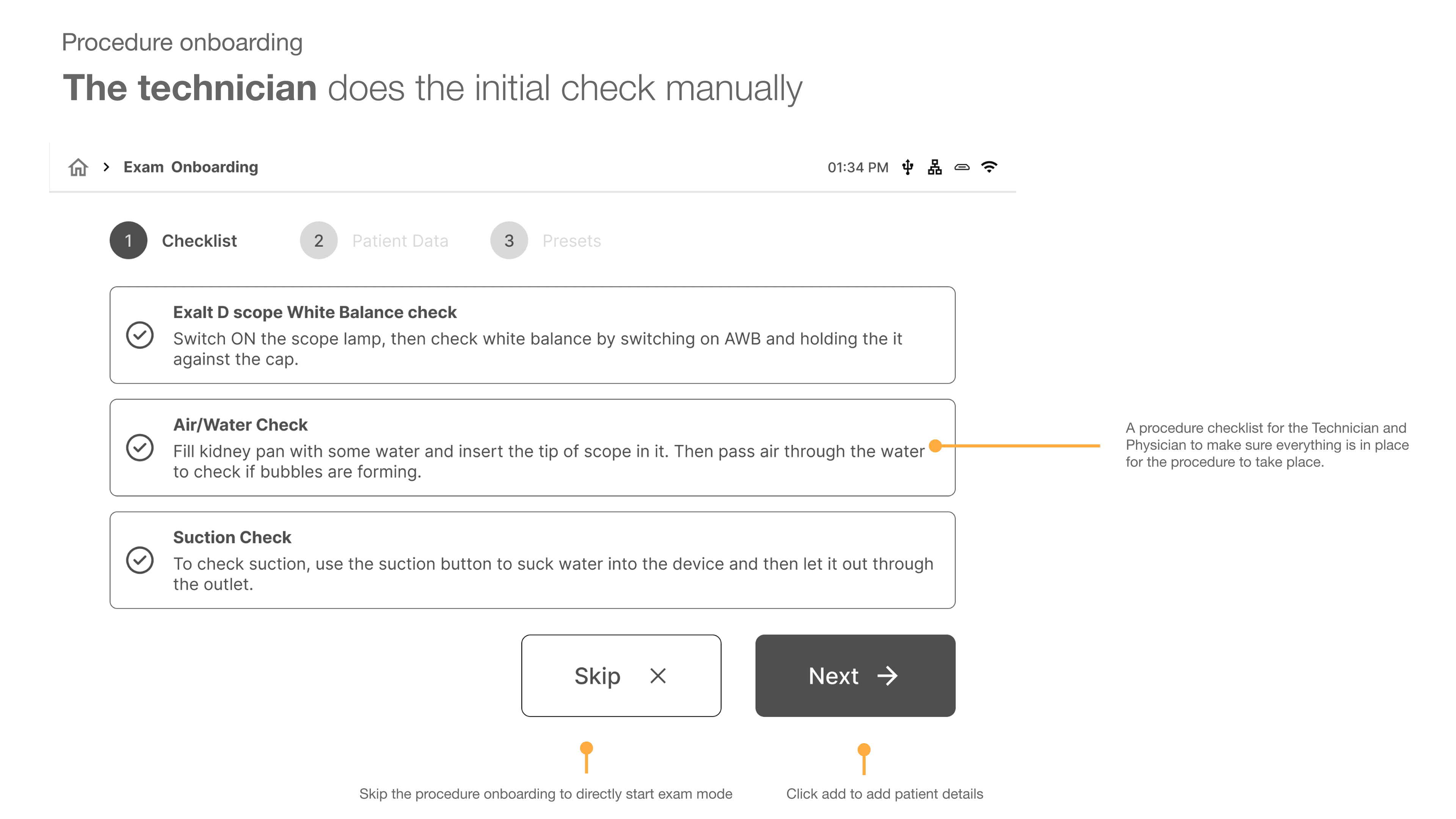
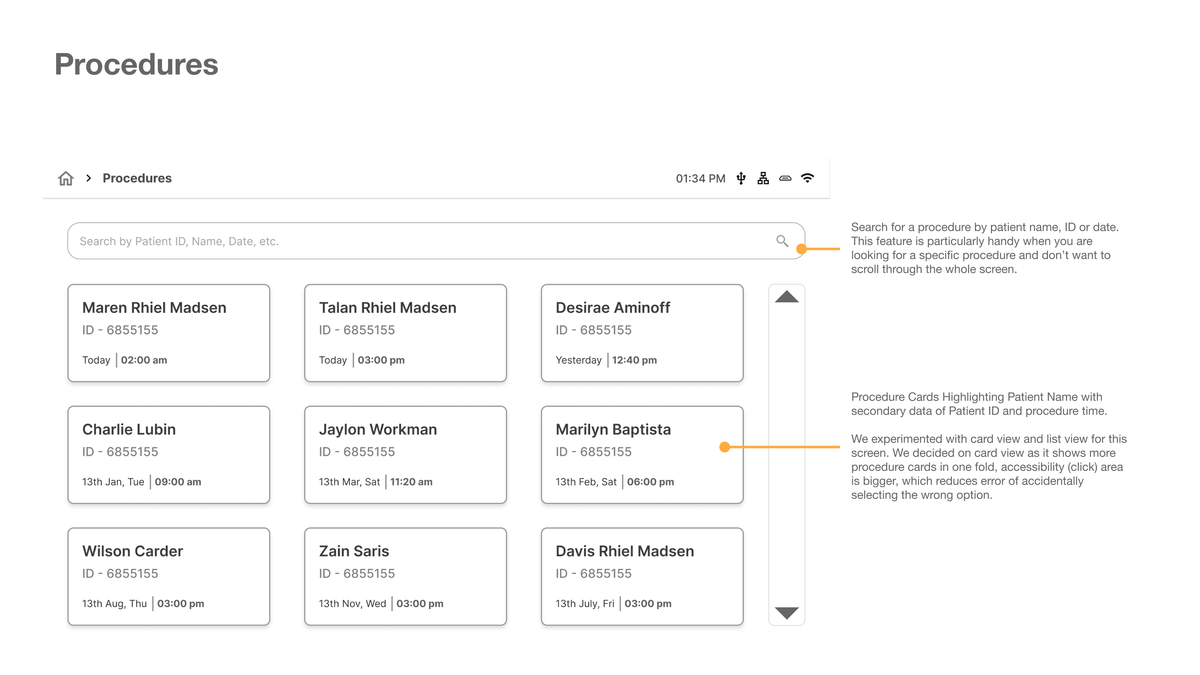
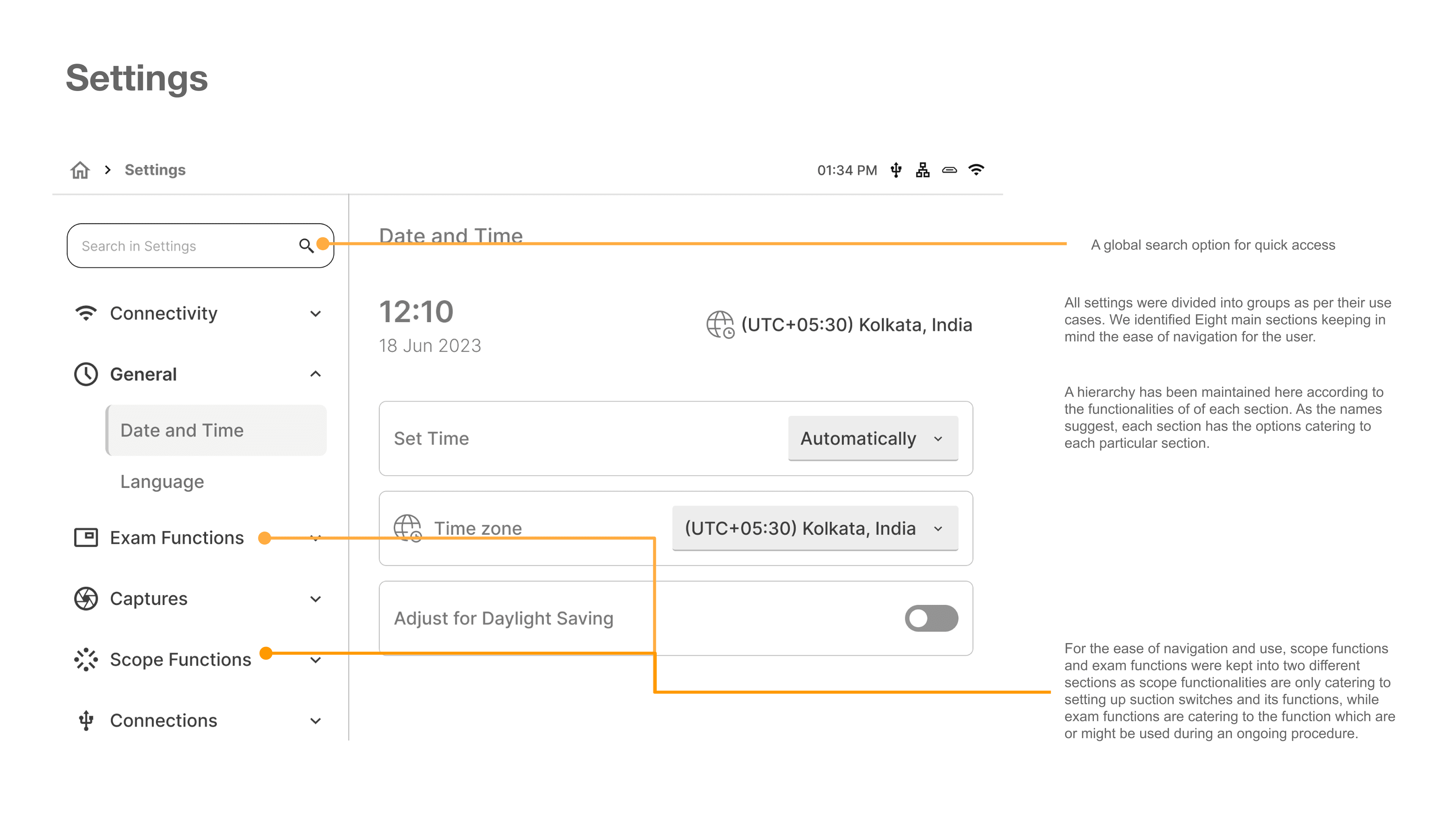
With a only a couple of months of engagement and hundreds of screens, every wireframe I handed off carried its own reasoning alongside it; annotated directly on the screen. For a client team spread across continents, that documentation did double duty: it made every design decision defensible on its own, and it meant a stakeholder could review a flow asynchronously and understand why a button was where it was, not just what it did.
With a only a couple of months of engagement and hundreds of screens, every wireframe I handed off carried its own reasoning alongside it; annotated directly on the screen. For a client team spread across continents, that documentation did double duty: it made every design decision defensible on its own, and it meant a stakeholder could review a flow asynchronously and understand why a button was where it was, not just what it did.


05 Visual identity
Brand Guidelines
and Usability Guidelines
Brand Guidelines
and Usability Guidelines
Visually designing the interface meant working within the client's existing brand guideline, while still shaping the interface around what physicians and technicians actually needed. The two weren't always in tension, the brand system gave us a starting point for color, type, and iconography, but every layout decision underneath it still had to answer to the usability principles we'd already established.
Visually designing the interface meant working within the client's existing brand guideline, while still shaping the interface around what physicians and technicians actually needed. The two weren't always in tension, the brand system gave us a starting point for color, type, and iconography, but every layout decision underneath it still had to answer to the usability principles we'd already established.
I worked closely with our senior UI designer to translate that guideline into a component library built for this specific interface (buttons, input states, layout cards, status indicators) so the visual identity stayed consistent across hundreds of screens without either of us redesigning the same element twice.
I worked closely with our senior UI designer to translate that guideline into a component library built for this specific interface (buttons, input states, layout cards, status indicators) so the visual identity stayed consistent across hundreds of screens without either of us redesigning the same element twice.


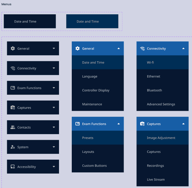
The final approved style landed on a dark interface: high contrast against a black background suits a room where screens compete with clinical lighting, and it kept the Capture button and status indicators legible at a glance, which mattered more than any aesthetic preference.
The final approved style landed on a dark interface: high contrast against a black background suits a room where screens compete with clinical lighting, and it kept the Capture button and status indicators legible at a glance, which mattered more than any aesthetic preference.

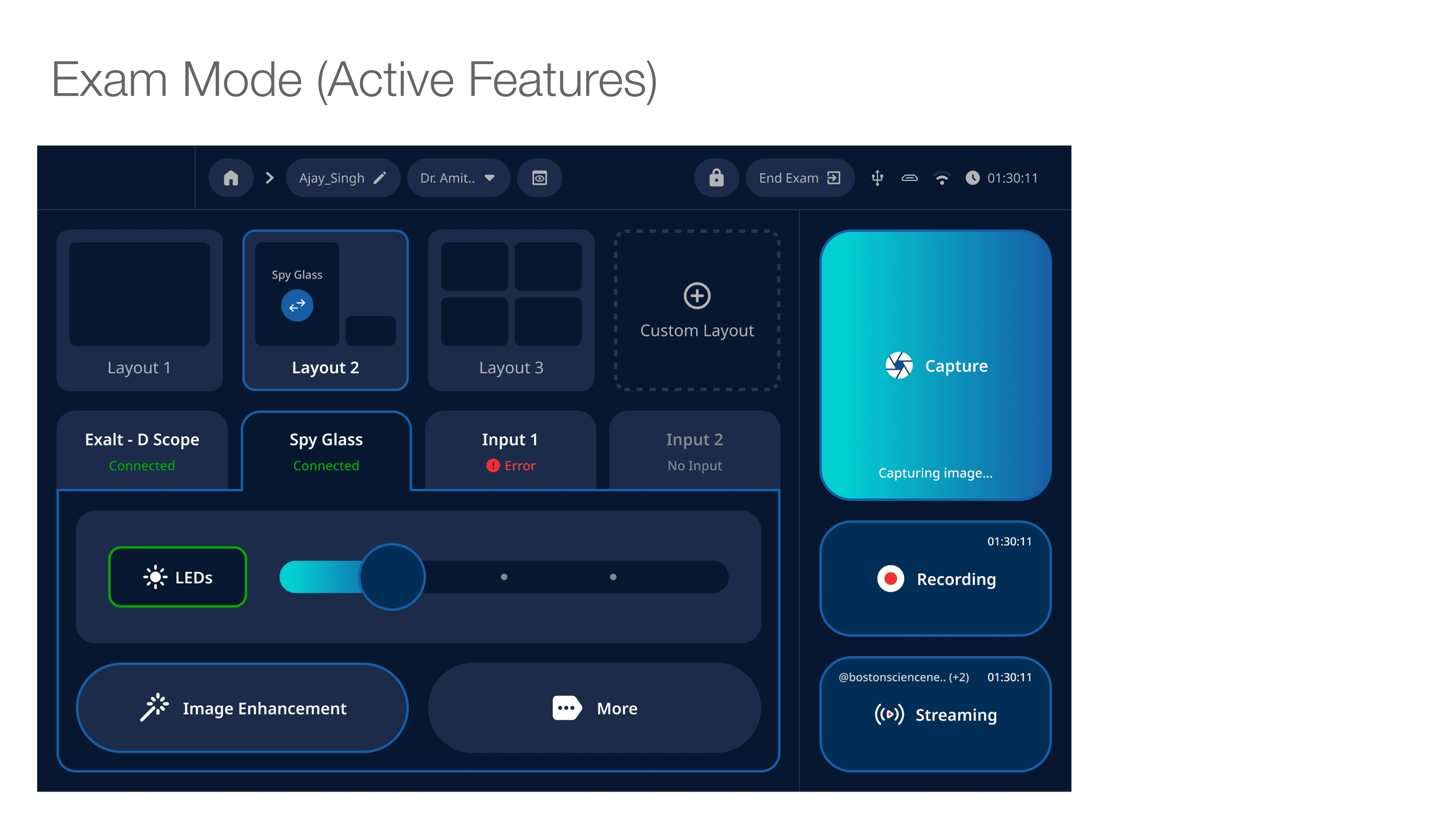
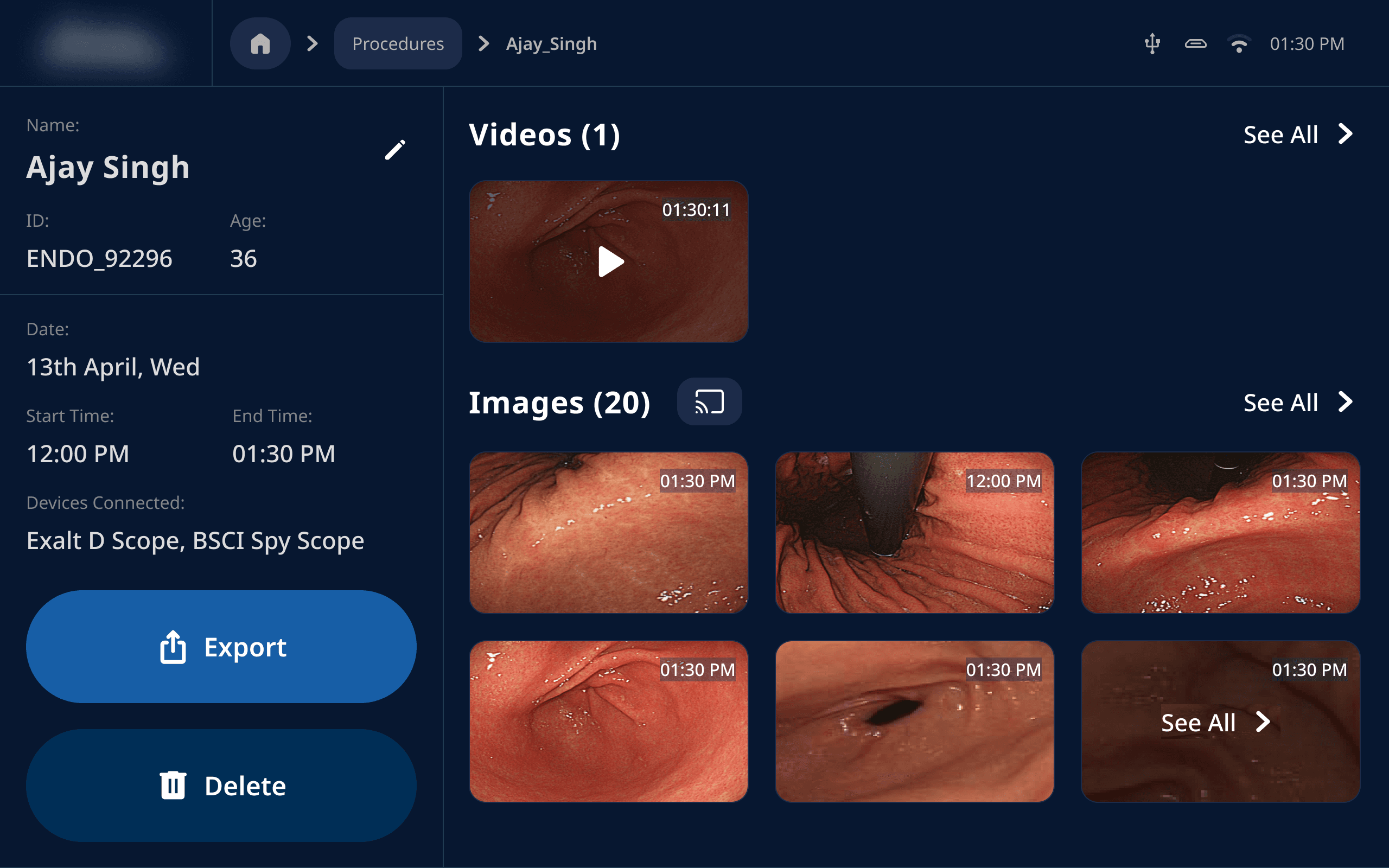
More Screens:
More Screens:



06 User Testing
What field testing revealed,
and what it changed
What field testing revealed,
and what it changed
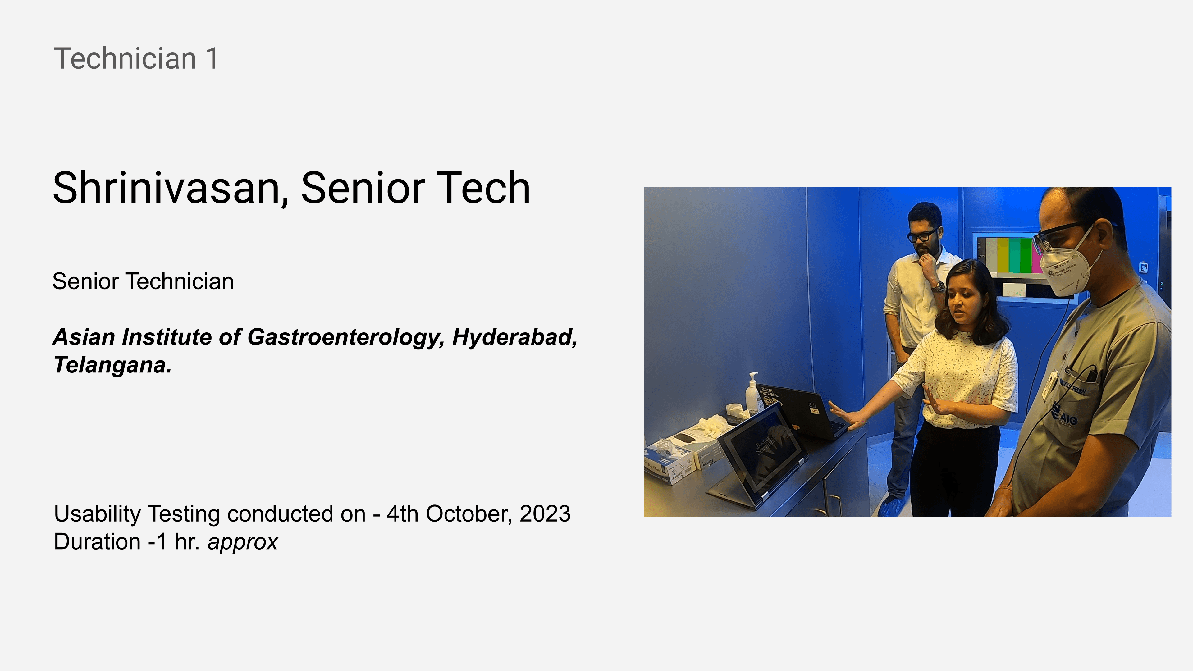
Once the mockups and key flows were finalized, they went into testing across the full user base, India, the US, Germany, and the UK. I conducted the India leg myself, across four cities.
Once the mockups and key flows were finalized, they went into testing across the full user base, India, the US, Germany, and the UK. I conducted the India leg myself, across four cities.
Physicians and technicians were asked to interact directly with the prototype. Since the Versatile Controller's hardware didn't exist yet, I used a touchscreen laptop sized to match its dimensions, close enough for users to engage with the interface the way they would the real device. To go beyond what they told us and see what they actually did, I brought in eye-tracking glasses to generate heat maps alongside every session, giving us a second layer of evidence against our own observations. Every session was also video recorded, so reactions and hesitations that might get lost in the moment could be reviewed and analysed afterward.
Physicians and technicians were asked to interact directly with the prototype. Since the Versatile Controller's hardware didn't exist yet, I used a touchscreen laptop sized to match its dimensions, close enough for users to engage with the interface the way they would the real device. To go beyond what they told us and see what they actually did, I brought in eye-tracking glasses to generate heat maps alongside every session, giving us a second layer of evidence against our own observations. Every session was also video recorded, so reactions and hesitations that might get lost in the moment could be reviewed and analysed afterward.


Every session was structured around four critical tasks, each mapped against an expected flow versus the observed flow, a habit that made deviations immediately visible rather than buried in notes, and gave the client team something they could review screen by screen without sitting in on the sessions themselves.
Every session was structured around four critical tasks, each mapped against an expected flow versus the observed flow, a habit that made deviations immediately visible rather than buried in notes, and gave the client team something they could review screen by screen without sitting in on the sessions themselves.
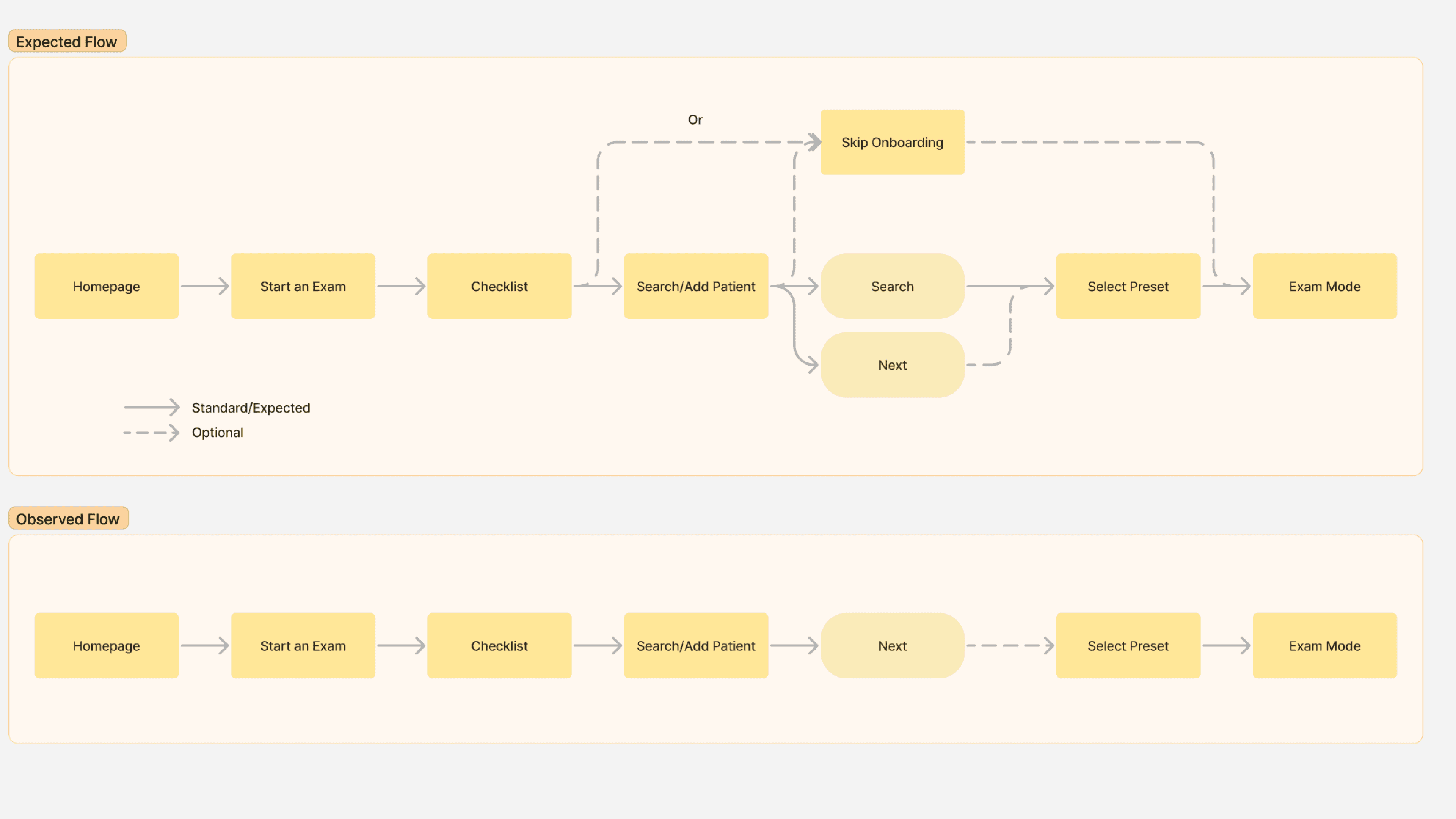


Exam onboarding was completed by every user with no or minimal errors: the individual steps needed no redesign, only better sequencing.
Scope settings and image controls were the single section users engaged with instantly, without any explanation required.
The export flow tested cleanly end-to-end, physicians found it, used it, and volunteered that it matched how they already worked.
Dark mode was the clear preference, with users citing legibility and consistency with the rest of the equipment already in the room.
Every user was able to complete the four critical tasks with the prototype, confirming the core information architecture held up under real clinical use, even where individual interactions needed refinement.
Exam onboarding was completed by every user with no or minimal errors: the individual steps needed no redesign, only better sequencing.
Scope settings and image controls were the single section users engaged with instantly, without any explanation required.
The export flow tested cleanly end-to-end, physicians found it, used it, and volunteered that it matched how they already worked.
Dark mode was the clear preference, with users citing legibility and consistency with the rest of the equipment already in the room.
Every user was able to complete the four critical tasks with the prototype, confirming the core information architecture held up under real clinical use, even where individual interactions needed refinement.
What Works!
What Works!
07 Reflection
What I'd do differently,
and what I'd do again
What I'd do differently,
and what I'd do again
This project sharpened how I think about invisible design constraints, the ones that don't show up in a wireframe review but define whether a device is safe to use under pressure. The regulatory standards weren't a checklist to satisfy after the fact; they shaped decisions from the first information architecture sketch, long before there was anything to test.
This project sharpened how I think about invisible design constraints, the ones that don't show up in a wireframe review but define whether a device is safe to use under pressure. The regulatory standards weren't a checklist to satisfy after the fact; they shaped decisions from the first information architecture sketch, long before there was anything to test.
I'd push to get a hardware prototype earlier. A touchscreen laptop got us real findings, but a physician's relationship with the actual device (its weight, its touch response) isn't something a stand-in fully captures.
The eye-tracking data was worth every bit of setup effort. Heat maps caught what task success alone couldn't: users completing a task while still looking in the wrong place first. And plus point, it was fun to use the glasses during testing!
I'd also validate procedure-specific content earlier. The presets confusion wasn't a screen problem, it was a structural assumption made upstream that testing caught later than it should have.
Thank you for reading:)
Thank you for reading :)
I'd push earlier for a prototype of the login and credential delivery flow, it was the one area where a system dependency wasn't surfaced until user testing.
Designing three separate IAs was right for the users, but added coordination overhead. I'd build in more explicit alignment sessions between the three product tracks from the start.
The field visits in Rajasthan were essential and I'd fight for them even harder. No desk research would have surfaced the offline-connectivity reality or the cultural context around how Preraks understand their role.
2026 Anoushka Sawardekar
2026 Anoushka Sawardekar